
Your brand is the first thing a potential customer judges you on, and they do it in seconds. This local business branding guide walks you through the foundations - logo, colour, typography and consistency - so that every touchpoint you put in front of people tells the same confident story.
Why branding matters more than most local businesses think
Many independent businesses in Torbay and across South Devon treat branding as something big companies do. In reality, strong branding is the tool that lets a smaller business punch above its weight.
When someone finds you on Google, clicks through to your website, then sees your van, your invoice and your social profiles, every one of those moments either builds trust or erodes it. If each one looks and feels different, the message customers receive is: "this business is not quite together." That doubt costs you enquiries.
Good branding is not about being flashy. It is about being consistent, professional and recognisable. That is something any local business can achieve.
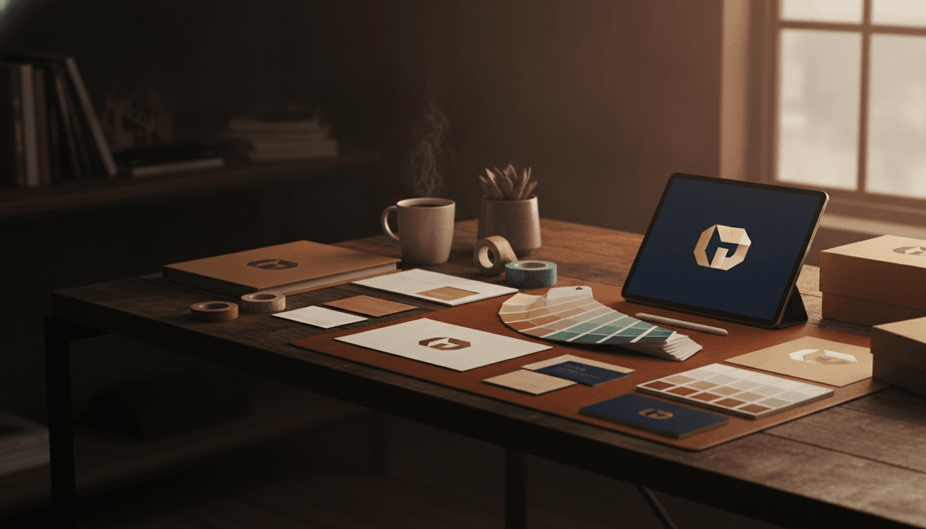
Start with your logo - and do it properly
Your logo is not your brand, but it is the anchor everything else hangs from. Get it wrong and every subsequent piece of collateral is built on a shaky foundation.
What a good local business logo needs
- Legibility at small sizes. Your logo will appear on everything from a website favicon to a van door. If it becomes unreadable when it shrinks to 40 pixels wide, it is not fit for purpose.
- A clear primary version and a simplified mark. Most logos need a full version (wordmark plus icon, or just wordmark) and a simplified icon-only version for square applications like social profile pictures.
- Supplied in the right formats. You need a vector file (SVG or AI/EPS) for print and a transparent PNG for digital. If your designer only handed you a JPEG, go back and ask for the proper source files. Those files are yours.
- Contrast that holds up in black and white. Test it. Print it in greyscale. If it disappears or becomes unreadable, the colour choices need revisiting.
Common mistakes to avoid
- Using a free online logo maker and calling it done. These tools produce generic marks that look identical to dozens of other businesses.
- Choosing a logo because you like it, rather than because it communicates the right thing to the right audience.
- Stretching or squashing the logo to fit a space. Lock the proportions and find a better crop.
If you are in Torbay and want a proper logo built from scratch - not a template reworked - take a look at our graphic design service in Torquay or graphic design in Paignton. We build brand identities that are designed to work across every surface.
Build your colour palette around two or three core colours
Colour does most of the heavy lifting in visual branding. It triggers recognition before a customer has even read a word.
Primary and accent colours
Most local businesses need a primary colour (dominant, used on headers, main buttons, key backgrounds) and one accent colour (used sparingly to draw the eye). A third neutral - usually a very dark or very light tone - fills the gaps.
Pick colours that:
- Reflect what you do and who you serve. A children's activity company and a law firm should not share the same palette.
- Work well together at scale. Two bold colours fighting for attention create visual noise.
- Pass WCAG AA contrast standards when text is placed on top of them. There are free tools online where you can check this in seconds. If a colour combination fails, your text is hard to read and your site may cause issues for visually impaired users.
What to document
Once you have settled on your colours, write down the exact values:
- HEX (for web and digital, e.g. #1F2328)
- RGB (for screen)
- CMYK (for print)
Do not rely on memory or picking a colour that "looks about right." One digit off and your amber becomes orange. Consistency requires exact values written down and shared with everyone who touches your brand.
Choose a maximum of two typefaces
Typography is the part of branding most local businesses skip - or get badly wrong by using whatever font came installed on a laptop.
You need two typefaces at most: one for headings and one for body text. They should complement each other without competing.
- Heading font - typically has more personality. It sets the tone.
- Body font - should be highly readable at smaller sizes. Clarity matters more than character here.
Once chosen, stick to them everywhere: website, social graphics, proposals, invoices, signage. If a designer or print shop proposes swapping to something else "because it looks nice," push back. Consistency is the point.
Apply your brand consistently across every touchpoint
Here is a checklist of the places your brand should appear with the same logo, colours and fonts:
- Website (including favicon, Open Graph images for social sharing, and email templates)
- Google Business Profile cover photo and posts
- Social media profile pictures and banner images
- Printed materials: leaflets, business cards, brochures
- Email signature
- Invoices and quotes
- Vehicle livery (if applicable)
- Uniforms or workwear
- Any signage at your premises
This is where a lot of local businesses fall down. The website was done professionally, but the Facebook cover photo is a stretched JPEG from three years ago. A potential customer who visits both will notice the inconsistency, even if they cannot name what is bothering them.
Our graphic design service covers the full range - from initial brand identity to ongoing digital and print assets - so every surface stays on-brand without you having to manage five different suppliers.
Create a one-page brand reference document
Once your logo, colours and fonts are decided, create a simple one-page document (sometimes called a brand style guide or brand sheet) that contains:
- Your logo in its primary and secondary versions, with clear space rules (how much empty space must surround the logo)
- Your exact colour values (HEX, RGB, CMYK)
- Your typefaces with examples of headings, subheadings and body copy
- A short note on what the brand should and should not look like (e.g. "photography should feel warm and local, not corporate stock imagery")
Share this document with anyone who produces anything on your behalf - designers, social media managers, print shops. It saves hours of back-and-forth and keeps everything consistent without you having to police it yourself.
How branding connects to your website and local SEO
Your brand and your online visibility are not separate jobs. When someone searches for a local service in Torbay and clicks through to your site, their visual experience either confirms or undercuts the trust they were starting to build.
A well-branded website that loads quickly and communicates clearly keeps visitors on the page longer and reduces the bounce rate. Both of those signals matter for your local SEO rankings.
Similarly, a consistent Google Business Profile with on-brand photos and a clear logo reinforces professionalism in the eyes of both potential customers and Google's local ranking algorithm.
We cover the areas around Torquay, Paignton, Brixham, Newton Abbot and across South Devon for both design and digital marketing, so if you want to improve both your brand and your visibility in the same project, that is something we can plan together.
Your website is also the canvas your brand lives on full-time. If you are rebuilding your brand, it makes sense to revisit your web design at the same time, so the two are built to work together from the start.
Frequently asked questions
How much does branding cost for a small local business?
This varies considerably depending on scope. A basic logo and colour palette from a professional designer costs less than a full brand identity system with style guide, photography direction and templates. The key is to get the foundations right first - logo, colours, fonts - and build outward from there. Starting cheap and redoing it in two years is usually more expensive than doing it properly once.
Do I need a brand style guide if I am a one-person business?
Yes, arguably more so. When you are working alone, every external supplier (printer, web developer, social media freelancer) needs clear reference points or they will make their own decisions. A one-page brand reference document takes a few hours to produce and saves you significant time and inconsistency over the years that follow.
Can I use Canva for my business branding?
Canva is a useful tool for producing day-to-day social graphics once your brand is established and your assets are loaded in. It is not a replacement for proper logo design. The built-in templates and elements are used by many other businesses, which means your brand risks looking generic. Use Canva to apply your brand, not to create it.
How do I know if my current branding is hurting me?
Ask someone outside your business to look at your website, your Google Business Profile, your Facebook page and any printed material you hand out, and tell you whether they all look like they belong to the same company. If they hesitate, or if the answer is no, that is your signal. Inconsistent branding does not announce itself loudly; it quietly costs you the trust you should be earning.
Ready to sort your brand out properly?
If your logo was done in a hurry, your colours are inconsistent, or your business simply does not look as professional as the work you actually do, we can help. We work with independent and owner-led businesses across Torbay and South Devon to build brands that hold up across every surface.
[Book a free strategy session](/# contact) and we will take a look at where you are and what would make the biggest difference.