Most small businesses treat design as decoration - something to sort out once everything else is in place. In reality, the opposite is true. Before a potential customer reads a word of copy, looks at a price, or picks up the phone, they have already made a judgement about whether a business looks trustworthy. Design is doing that work invisibly, every single day.
This matters more in a tight-knit area like South Devon than it does in an anonymous city. A Torquay tradesperson, a Paignton salon, or a Newton Abbot independent retailer is trading on local reputation. That reputation has to hold up across a van livery, an Instagram story, a quote document, and a shop window - all at once. When those things look inconsistent, people notice, even if they cannot name exactly why they felt uncertain.
What Good Brand Design Actually Looks Like
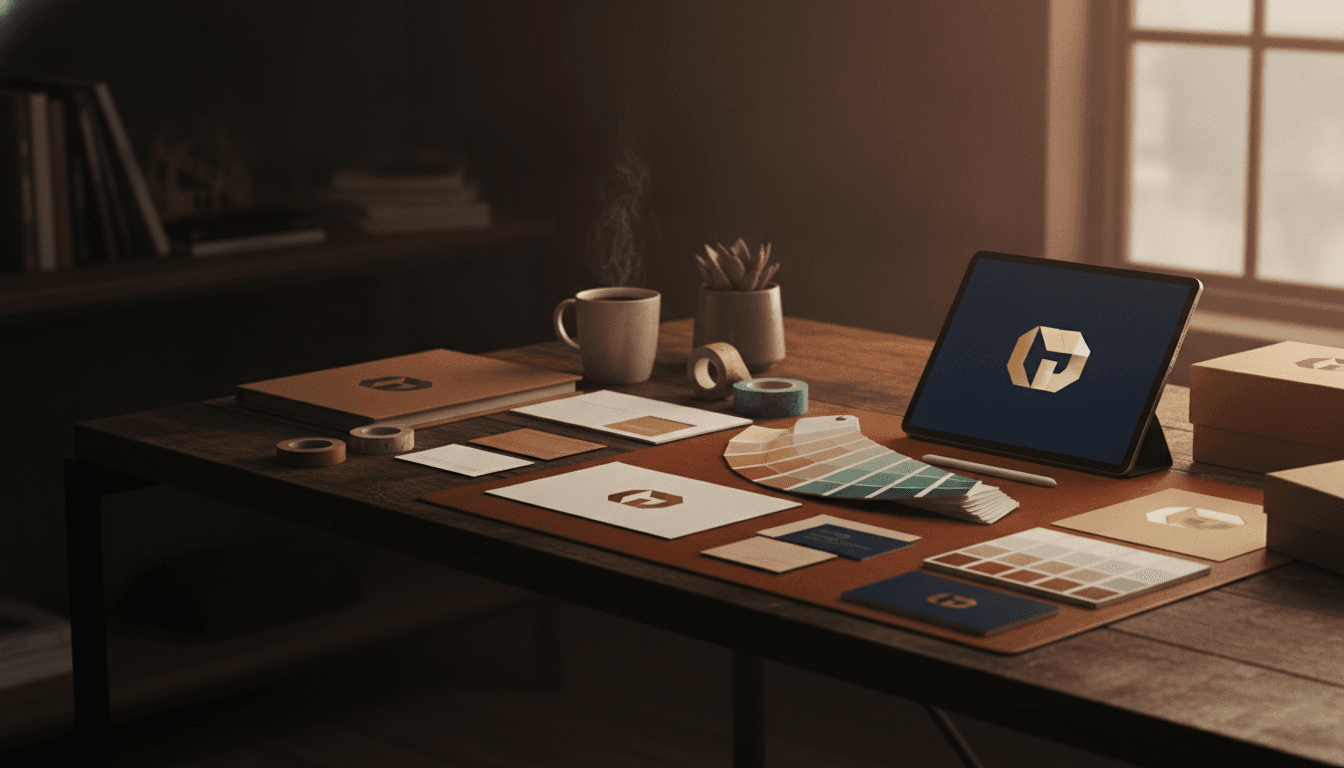
Good brand design is not about having an expensive logo. It is about having a coherent system - a set of decisions (colours, typefaces, shapes, tone) made once and applied consistently everywhere. That system is what lets a business owner hand a designer a brief for a new leaflet and get something back that immediately looks like them, without starting from scratch.
A few things that genuinely make the difference:
- Colour discipline. A primary palette of two or three colours, used consistently, builds recognition faster than any tagline. This means resisting the urge to use every colour in the brand kit depending on the mood of the month.
- Type hierarchy. Pairing a distinctive heading font with a readable body font - and sticking with it - makes every piece of communication look considered rather than cobbled together.
- Whitespace. Crowding a design with every possible message is one of the most common errors small businesses make. Good design creates breathing room, which paradoxically makes the important message land harder.
- Print-ready files. A logo that looks fine on a screen can fall apart on a vinyl banner or a letterhead. Proper brand assets include vector formats (typically SVG or EPS) that scale without degrading, not just a PNG exported from a website builder.
If you want to see how these principles apply in practice for businesses in your area, the /blog/ has practical articles covering brand and design for local independents.
Common Mistakes to Avoid
The most frequent design mistake small business owners make is treating every new marketing channel as a blank canvas. A new Facebook page gets a different feel to the website. The leaflet looks nothing like the business card. The email signature uses a different logo version to the van.
Each of these inconsistencies is small on its own. Together, they signal an amateur operation - even if the underlying business is excellent.
A second common error is confusing a logo with a brand. A logo is one element of a brand identity. Without the supporting decisions around colour, typography, imagery style and tone, a logo is just a graphic. Businesses that invest in the full system see the return on that investment spread across every asset produced afterwards - because every new piece of work has a clear brief to work from.
If you are based in Torquay, Paignton, or Newton Abbot and want to talk through what a brand refresh would look like for your specific business, the local pages for graphic design in Torquay, graphic design in Paignton, and graphic design in Newton Abbot have more detail on how we approach work in each area.
How Graphic Design Connects to Your Other Marketing
Design does not sit in isolation. A well-built brand identity makes every other marketing channel work harder. A professionally designed website built on clear brand guidelines converts better than one where the design is being figured out as the site is built. Social media content produced from a coherent brand system - consistent colours, consistent voice, consistent visual language - builds recognition over time rather than just generating isolated posts.
The practical implication is that investing in brand identity early pays back across every channel. You are not paying for a logo, you are paying for a decision-making framework that removes guesswork from every future piece of marketing.
What to Expect From the Process
A proper brand or identity project starts with a brief, not a mood board. That means understanding the business, its customers, its competitors locally, and what it needs to communicate - before any visual work begins. The design phase then produces a small number of considered directions rather than a hundred options to scroll through. Fewer options, but the right ones, is almost always more useful than an overwhelming volume.
Deliverables should include final files in every format you will actually need - print-ready, web-optimised, and sized for social - along with a simple brand guide that any printer, designer, or marketing supplier can follow.
If your current visual identity is holding your business back, or you are starting from scratch and want to get it right first time, book a free strategy session and we can look at exactly what you need.